

sabi
-
Posts
582 -
Joined
-
Last visited
-
Days Won
4
Content Type
Profiles
Forums
Events
Store
Downloads
Gallery
Everything posted by sabi
-
As a student of early iron tsuba and the Momoyama period as a whole, I suppose it was only a matter of time before I made the jump to ceramics. A few months ago I picked up a couple books on the subject (shocker, they were CHEAP!), and was instantly hooked. Drawn to the rustic simplicity of Bizen, bold and free spirited Oribe and Seto, and my favorite; the slouchy, irregular yet sublimely powerful wares of Iga and Shigaraki. My interest in the latter took off, and it wasn't long before I yearned for a piece of my own. A while back I took a liking to nigori sake, so what better place to start than a guinomi! This cup measures 2.5" tall, 2" wide and holds just under 3oz of the drink of your choice. I have used it frequently over the past couple months, and as wonderful it is to admire, it's even better in action. A good guinomi must have both of these qualities IMO. This cup is easy in the hand, drinks well from any position around the lip and has zero wobble. The aesthetics of this piece encompass everything that I fell for in Iga works. While small and unable to command the kind of power you would get from a mizusashi or even a chawan, this little guy has an amazing presence and the spirit of the artist is in clear view. The cup was laid down on it's side where the red area remains untouched by the natural ash glaze. There are scorch marks left behind by two seashells that were burned during the firing. The shells are also the cause of the copper orange hues that form a halo around them, due to the salt content. Light green glaze covers the rest of the body, and pools to a stunning dark green tombo no me (dragonfly eye). Peach and sunset tones line the interior and provide a beautiful contrast against hazy white, unfiltered nigori. Above all of this, I think the form of the cup steals the show. From every angle, the quintessential Iga slouchiness is present but never bordering on sloppy or careless. The overall mood is strong and dignified despite its intentional lean. Here is a quick write up on Aiko San as well for those who are interested: http://www.artisticnippon.com/product/igayaki/watanabe_aiko/watanabe_aiko_article1.html Thanks for taking the time to stop by and reading my unnecessarily long write up about a single cup. Doing this helps my pursuit of understanding ceramics, which has only just begun!
-
Wonderful piece my friend! Do let me know if that one ever needs a new home! I have a new Yunomi as well... Made by an Iga-based artist, Atarashi Manabu, however it's a bit of a departure for him and done in the ki-seto style. I particularly enjoy how the scorch marks look like dragonflies.
-
Pete - I've read a bit on that and it certainly seems plausible. There are clear similarities between Owari sukashi and the work of the ko Akasaka masters, specifically the first two IMO. A shame indeed that so much information has been lost to time! I would also like to correct my earlier post, as ko Akasaka theoretically extends into the 18th century. The third master, Tadatora, has a death date listed as 1704.
-
Great post by Pete, and to drive his point in a bit further we also have Ko-Akasaka, which refers to the first three generations. However, they aren't "ko" in the pre-Momoyama sense as they span from the early to late 1600's. So in this case it's more of a literal tag, early Akasaka.
-
Master Forger Needed - Forged In Fire
sabi replied to Brian's topic in General Nihonto Related Discussion
The only guy I know is on Vancouver Island: http://islandblacksmith.ca/ -
I agree with Mauro, need better pics to be sure. My instinct says cast, color is off and is the same throughout the whole plate including the sukashi walls. The openwork elements also seem a bit crowded and muddy. I'd expect a real Kanayama guard to be a bit thicker as well.
-
Nihonto.com - Fred Weissberg's Site
sabi replied to nagamaki - Franco's topic in Auctions and Online Sales or Sellers
FYI - Fred's site is back up as of a couple days ago. -
Hey Florian, thanks for the picture! I'm stunned I haven't seen that one before. Which book is it from? It's hands down the most similar Musashino rendition I've come across, almost shockingly so. Mine is fairly large at 8.4 x 8.3 x .5 and good eye, there is a visible fold line in the hitsu ana. It also has a few very subtle globular tekkotsu on the face of the plate. I really enjoy Sasano's comments as well, in particular on the iron/patina and the nod to the seppa dai and hitsu ana . One thing that stands out to me regarding the composition of my tsuba is how well shaped and proportioned they are, and the deep purple tones are in full display. I tend to agree with Jim's assessment that it's more in the Momoyama range. I think the size along with the bold, carefree execution of the motif are pretty spot on for the period. The depth of the patina and the construction method also argues for earlier. Of course, this is only my opinion. Thanks so much again for that picture, made my day!
-
Apologies Florian... I missed your reply a few months back, was just browsing and came across this again. I don't know much about swords, but I am familiar with the concept of kawari-deki. Regarding tsuba, there are some that have been given a "Den" notation; generally meaning that the guard shows clear traits of one school, plus or minus a certain characteristic. I can't say if this is taken negatively by collectors or the organizations that issue papers. At the end of the day, a good tsuba is a good tsuba regardless of its attribution. This thread covers it to an extent and I thank those that posted in it. I'm simply re-stating what I've learned. http://www.militaria.co.za/nmb/topic/17408-den-kanayama/?hl=kanayama I won't pretend to know enough to suggest that the classification system needs to be revisited, but I completely agree with the assumption that there were artists who produced tsuba in different styles, either due to customer commissions or personal artistic inspiration. There's a wonderful article on ceramic wares of the Momoyama/Early Edo period that details excavations of Kyoto based kilns. It shows that provincial style tea accessories were produced locally and suggests that at least in some cases, the potters themselves re-located from Seto, Mino etc. rather than them simply being copied by local artists (which I'm sure also occurred to great extent). In addition, it's well known that the great ink masters of this period traveled all over Japan to paint commissioned works. Could there have been some tsubako who re-located, thus owing to some of the blended styles that we encounter? If craftsmen in other disciplines did, I certainly think it's plausible. Fun stuff either way! I also own a tsuba that shows traits of both Owari and Kyo. Jim Gilbert believes it to be a guard that was made in Kyoto, but with a strong dose of Owari thrown in. I agree with the assessment, particularly citing the overall aesthetic and iron itself. The composition is loaded with finesse, but the execution is rather bold. I believe the hitsu ana to be slightly wide compared to the average Kyo piece and the patina is deep and dark, much like many Owari tsuba of the period. The key point for me though is the iron and the finish, as it's without a doubt Kyo style. The seppa dai is also classic Kyo Sukashi. I do agree with Jim that given the context of the time, it seems highly unlikely that this guard was made in Owari with Kyo iron. And man, on that note I should really get back to work! Here are a couple shots of mine, because who doesn't love pics?
-
Glad someone else remembered that piece! Came here to link it, I must have sifted through the Holbrook tsuba on Grey's site dozens of times when I was first getting into the hobby. When I saw your thread title I immediately thought of that tsuba.
-
Exactly why I should stick to old iron, there I at least have half a clue ='D My latest acquisition, one that I'm sure many of you will recognize. This thread needs more old iron!
-
Looks mid Edo "Tosho" to me. The size, thickness and iron rule out anything early IMO.
-
Awesome post Darcy, I know very little about these type of tsuba but the difference in composition is striking. Found this example on the MFA website, the chaotic nature is abundant in this tsuba and the overall feel versus the "robotic" variants is far more dramatic. Great stuff!
-
One last photo to add to this thread; had some good sun and was able to capture the purplish tint this guard gives off in certain light. I've been toying with the idea of submitting this to one of the NTHK's stateside shinsas. I think it could do pretty well. I hope you all are enjoying the weekend! If it's not your weekend, keep at it!
-
Ah that first book seems like a great read for sure! Even has a gourd on the cover! Thank you for all of the wonderful recommendations, Tao Te Ching has been on my list for awhile but I've read so many opinions on which translation to get that I never seem to pull the trigger. - Back to the tsuba; I was able to get some shots of the rim today along with a couple straight on in direct sunlight to show the wonderful surface work. The tekkotsu are actually more globular than granular. There are a couple small granular spots but the bigger ones are very irregularly shaped.
-
John, thank you very much! I haven't gotten to Taoism yet, any reading you can recommend? Thank you Steve! You have shared some wonderful tsuba here and I wish I had the coin for your Honda clan guard! That's quite a beauty. My initial thoughts on this piece are pointing me in that direction as well. This motif is used a lot in early Shoami work but the iron, styling and strong seppa dai are classic Owari indeed. Thank you Brian! Glad you enjoy it!
-
Well, sort of For those of you not familiar with the old Zen riddle and painting, it simply asks; how do you catch a catfish with a gourd? There is a technical answer to this, but it's also been suggested that there was no correct response and it was just a bit of ancient silliness. I recently picked up this tsuba as I thought it would make a great study/collection piece. Old iron is my favorite and couldnt pass this one up! I found the design to be very pleasing yet strong, the workmanship appeared good and it also looked to have a bit of age to it. I was able to get some pictures together over the past few days, it's been pretty dreary here and that's my preferred light to shoot iron tsuba. This tsuba measures 6.9cm tall, 6.95cm wide and is .5cm thick at the rim, which is kaku mimi konishu. It displays fine granular tekkotsu and the nakago and kogai hitsu ana are fitted with copper sekigane. Motif is a Buddhist manji symbol in the form of four hyōtan, or bottle necked gourds. Both popular images within Zen Buddhism and the lowly gourd was even adopted by Toyotomi Hideyoshi as a battle standard, to which he would add one for each victory. The sukashi has a fine tsuchime finish and while it gets heavier in some areas, the whole plate is silky smooth to the touch. Patina is rather blackish and gives off subtle flashes of chocolate brown and purple tones depending on the light. Looking at the overall workmanship, design and construction, I believe this piece to be early Edo (1650) at the latest. It does give off a strong tea culture vibe to me, and I could see this being late 1500's work. That is pure speculation of course, I certainly don't know enough to state that firmly. I have a couple ideas regarding the school , but for now I'm enjoying taking my time studying before commiting to one in particular. It does show flavors from a couple... The return of my Sasano silver book that is currently on loan with a friend will be much welcomed! I haven't posted in a long time but have been quietly lurking here and there. This is my first acquisition in months and I wanted to finally contribute again! Hope you all enjoy the pics and I'll be sure add to this thread as my study continues. All discussion is encouraged and greatly appreciated! Thanks for reading! -Evan
-
Good thread, one of my favorite subjects of old iron is the many examples of "cross-fertilization" between different styles. The post by Mikolaj is a great example of this and while I'm not always sold on papers being a definitive answer, I think they got that one right. I agree with Arnold's observation. The seppa dai tends to be more slanted and less stout on Kyo pieces, this is evident with Florian's tsuba. If you look at the second guard posted, it exhibits the rounder variant. Im thinking with the piece in hand, the iron was much more suited to Kyo and that determined the final result. But I don't think it can be denied that it has a strong Owari influence. Thickness could have played a big part in the Kyo decision as well at 0.4cm. Florian, I believe your tsuba to be Kyo. The shape of the seppa dai and squeezed hitsu ana you mentioned, softer stylism and rounded rim lead me to that educated guess. Patina looks good and it apoera to have a bit if age to it from here as well! -Evan
-
Yeah I wasn't sure if he was thinking I made it or just nicely done on the project as a whole lol. I love Stuarts work and he was on the short list of people who I knew could do this menuki justice. I certainly wouldnt have sent it to just anybody.
-
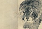
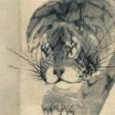
Haha! Still have no idea on the leopard/tiger debate, nor the school bit it doesn't really matter. Nice little menuki. The steel is W2, very high performing tool steel that is known to produce wonderful hamons when forged and heat treated properly. The pics aren't the best, its a bit more defined in real life. This piece also has an iori mune. This is about as traditional as you can go while still having a functional EDC knife. I've had a full on nihonto style ko-tanto commissioned and the thickness of the whole package along with the wooden says make it a tough carry. The leather sheath slims down the package considerably but still provides a nice canvas for some creative embellishment.
-
Figured I'd update this for kicks. This is what I eventually did with this piece, and it was my original intention when I bought it. Knife and sheath by Stuart Branson. Sheath is lined with deerskin to be as gentle as possible on the ito and menuki.
-
Hi Evan, Just stating my educated opinion take it or leave it. No your tsuba is not on the thin side and is fine. Many tsuba made by the fourth, firth, and six generations have this what I would consider average thickness. Still think it is forth generation School work as the design is original and not a copy of a design developed by one of the Higo schools. It would likely get a plain "Akasaka (赤坂)" or even a "yondai Akasaka (四代赤坂)" attribution if your lucky to the middle Edo Period (江戸時代中期) but submitting it to NTHK might still be a good learning experience. Being there in person at the show for the NTHK shinsa is a good idea because they have answered my question afterwards in the past. Sorry, should have been more specific. I just meant on the thin side for the first three generations. Either way, I couldn't be happier with the piece. Like you said, it's an original design and many Akasaka works that pop up are the later generation, Higo copy types. I have tossed around the idea of submitting this as I have seen a fair amount of papered Akasaka tsuba pinpointed to a certain generation. However, it does appear to be very hit or miss...
-
Is it papered? NBTHK or NTHK? It isn't, however I was thinking about submitting it to the 2015 NTHK shinsa in Chicago. Still trying to decide...
-
Hey David! Thanks for stopping by! Yes, it is on the thin side for Akasaka work however I have come across examples attributed to each of the first four generations that are in the 4.5-5.5mm thickness range. Those tsuba also tend to be smaller, like this one. Wish you still had your pieces! I'd love to see what you came across!
-
Hello all! I've been burying myself in Sasano's silver book lately and while doing so, managed to add a piece to my small collection. While learning and researching tsuba, I have found myself heavily drawn to iron ji sukashi examples. I love most types of iron plates overall, but bold, positive relief designs are the ones that I enjoy studying the most and have the highest interest in acquiring. Early on in my research, I focused mostly on pre Edo tsuba. While making my way through Sasano's book I became very intrigued by Akasaka designs. The flow, elegance and widely varying motifs drew me in and I started focusing on them solely, particularly the work of the first four generations. I was browsing a few weeks later and came across an ex-Holbrook collection piece that I had to have, and that is what I have come to share with the board today. Let's get to it! This specific tsuba is a classic representation of the school, in my opinion. The motif is the moon caught in a pine tree, framed in the textbook Akasaka square shape. I really enjoy the intimacy of the design achieved by placing the full moon in the foreground. The design uses every millimeter on the plate and creates a nice sense of spontaneity and open space. The hitsu ana are seamlessly worked into the design, and when looking at the piece as a whole, they essentially disappear. This is also a trademark of the school and there are many examples with incredibly clever hitsu ana. The iron on this piece is just wonderful. The patina is a rich chocolate brown and has an incredibly soft feel to it. The plate is perfectly healthy with no light spots and a glowing luster. These last two photos were purposely taken with flash, as it's been gloomy here for the past week and I wanted to display it's true color. With no sunlight around, this was my only option but I think it's represented nicely. The measurements are: 7.1 x 6.6 cm, .50 cm at the seppa dai and .45 cm at the mimi. The combination of the iron, subject, execution, stylism and dimensions are no doubt an expression of the first four generations. Exploring the details even further, this one has been given to the third generation, Tadatora (died in 1707). I studied this tsuba extensively before deciding to make it mine and I completely agree with the attribution. You simply don't see design work (or iron) like this in the later generations and the styling shows off the carefree nature of the third master. I hope you've enjoyed this post! Any comments, questions etc. are greatly appreciated and encouraged. If any of you have Akasaka work that you'd like the share, I'd love to see it! Thanks for taking your time to read and I look forward to any discussion. Hope everyone is having a great weekend!